In the modern era of remote work, your home office is more than just a room—it is a cognitive environment. While we often obsess over ergonomic chairs and high-speed internet, we frequently overlook the most dominant element in the room: the color of the walls.
Color psychology suggests that the wavelengths of different hues trigger specific chemical responses in the brain.1 By strategically choosing your paint palette, you can effectively “biohack” your mood, sustained focus, and creative output.
🔵 The Concentration Catalysts: Blues and Teals
Blue is widely regarded as the most productive color for the average office worker. It is a “stable” color that helps the mind remain calm and focused on repetitive or high-detail tasks.2
- Best for: Accountants, coders, writers, and anyone performing deep-focus work.
- The Psychological Effect: Lowers heart rate and stimulates the mind without causing physical agitation.
- Pro Tip: Use a soft Sky Blue to open up a small room, or a deep Navy for a sophisticated, “executive” feel that commands self-discipline.
🟢 The Harmony of Nature: Greens and Sage
Because the human eye is most accustomed to seeing green in nature, it requires the least amount of strain to process.3 Green represents balance and growth.4+1
- Best for: Professionals who work long hours or those in high-stress environments.
- The Psychological Effect: Reduces eye strain and provides a sense of reassurance and tranquility.5
- Pro Tip: Sage Green is currently trending as a “new neutral.”6 It provides enough color to feel curated but remains quiet enough to prevent distraction.7+1
🟡 The Creative Spark: Yellows and Oranges
Yellow is the strongest psychological color. It stimulates the ego and the spirit, making it the ultimate hue for innovation and optimism.8
- Best for: Designers, artists, marketers, and entrepreneurs.
- The Psychological Effect: Triggers the release of serotonin and fosters a sense of confidence and “outside-the-box” thinking.
- The Warning: Too much bright yellow can lead to anxiety or frustration.9 Consider a Muted Ochre or use yellow as an accent wall to avoid “visual noise.”
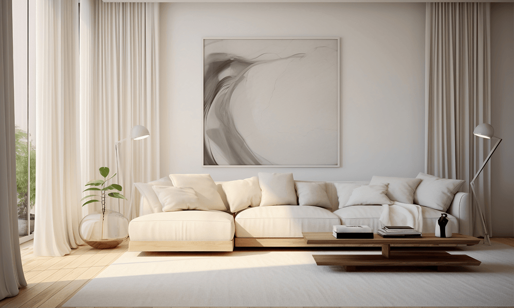
⚪ The Minimalist Canvas: Whites and Greige
Many people default to white, but not all whites are created equal. A stark, sterile “Hospital White” can actually feel cold and draining.
- Best for: Those who need a “clean slate” or work with physical materials where color accuracy is vital (like photographers).
- The Psychological Effect: Promotes a sense of cleanliness and organization.
- Pro Tip: Look for “Warm Whites” with a hint of cream or “Greige” (Gray-Beige) to prevent the space from feeling clinical.
💡 3 Golden Rules for Choosing Your Office Paint
- Follow the 60-30-10 Rule: * 60% Main Color (Walls)
- 30% Secondary Color (Upholstery/Shelving)
- 10% Accent Color (Decor/Art)10
- Consider the Saturation: The intensity of a color often matters more than the hue itself. A highly saturated, bright blue will stimulate you, while a low-saturation, gray-blue will soothe you.11
- Test the Light: Paint a large swatch on your wall and watch it change from morning to night. Artificial LED lighting can turn a beautiful “Warm Grey” into a muddy purple instantly.
🏁 Summary Table: Which Color Do You Need?
| Goal | Recommended Colors | Mood |
| Deep Focus | Navy, Soft Blue, Teal | Calm, Calculated |
| Stress Reduction | Sage, Moss, Eucalyptus | Balanced, Refreshed |
| Creativity/Energy | Terracotta, Mustard, Peach | Optimistic, Bold |
| Clarity/Order | Warm White, Light Grey | Organized, Airy |


Leave a Reply